


WINTER 2024
Blooms
VISUAL IDENTITY, PRINT COLLATERAL, RIBBONS, TISSUE PAPER, STICKERS
BRAND OVERVIEW:
Blooms began as a pop-up flower boutique and blossomed into Pittsburgh’s first mobile walk-in flower truck. With the upcoming opening of their brick-and-mortar storefront—complete with a coffee shop and women’s boutique—it was time for a brand identity that could grow with them. Amy envisioned a brand refresh that felt more mature, modern, and luxurious—reflecting how the business had evolved and preparing it for the next chapter. The identity needed to embody craftsmanship, creativity, and warmth, with a tone that could speak to both a loyal local following and a new wave of clientele discovering the shop.
Industry: Floral design
-
Design Assistance: Kait Richert

We started by diving deep into the Blooms ethos: flowers as a joyful, sensory experience—never rushed, always refined. The strategy focused on honoring Amy’s sustainable values and boutique-level quality while elevating the brand visually to match its luxurious, bespoke offerings.
From our initial conversations, key values emerged which we used to guide the direction of the brand identity.
Sustainability without compromise,
Floral design as an act of art and care,
Modern sophistication with emotional warmth

The color palette leaned heavily on shades of green which was intentional from the beginning. Amy mentioned that she originally shied away from using green in her arrangements so what better color to offer as a backdrop to help her blooms really stand out than shades of a natural surrounding.
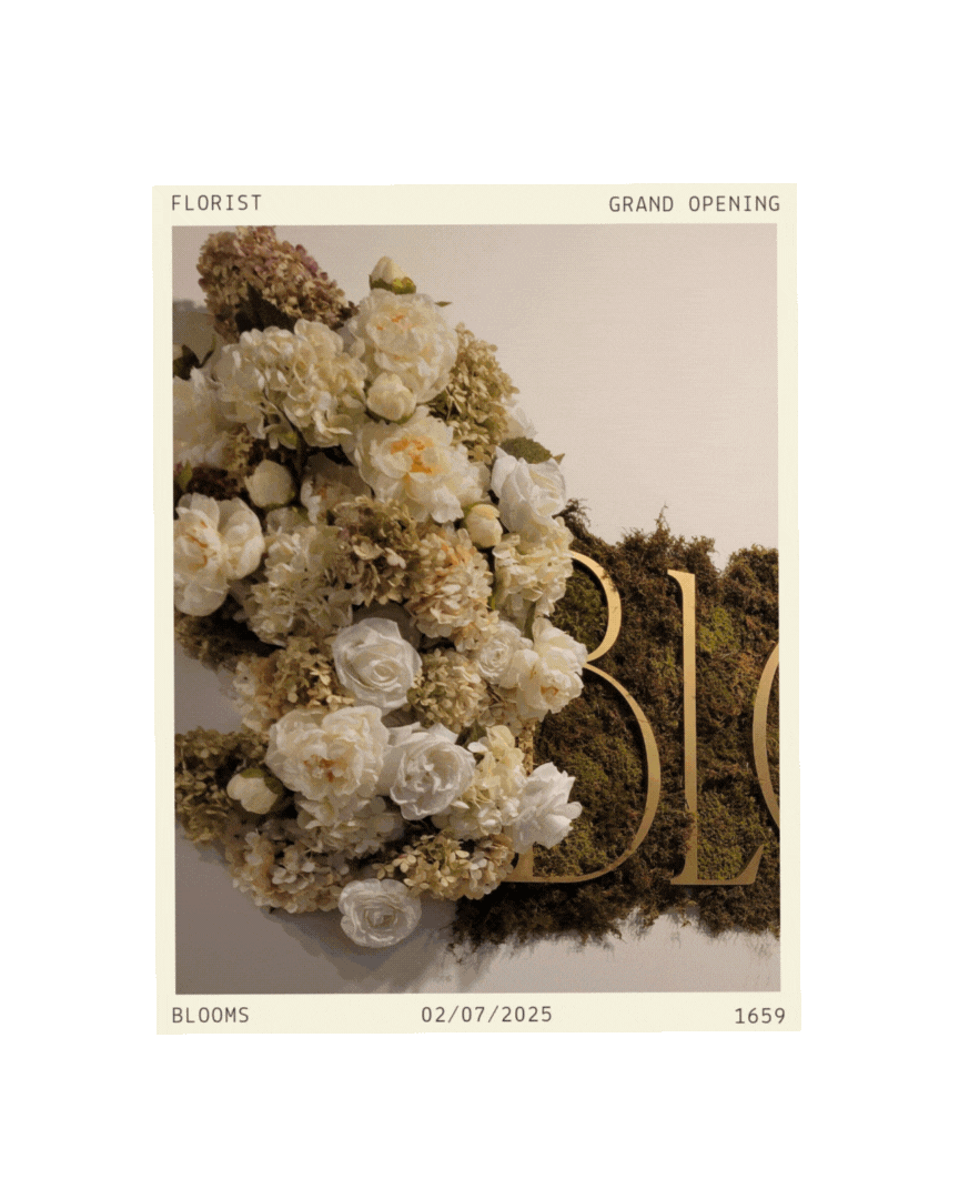
Images taken from Amy’s grand opening of her brick and mortar and her custom made sign.


I enjoyed all of our communication discussing concepts and then seeing all of our/your ideas turned into tangible pieces for my brand. Your explanations for your creations helped me to understand the connections and purpose for everything. I really enjoyed working together and am beyond excited to put everything to use soon in Cranberry!
-Amy