SUMMER 2020 | V12
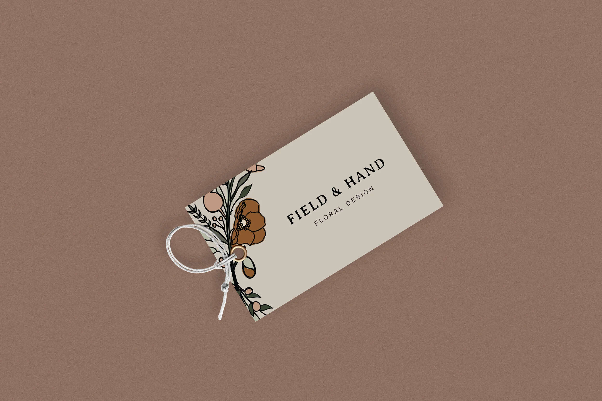
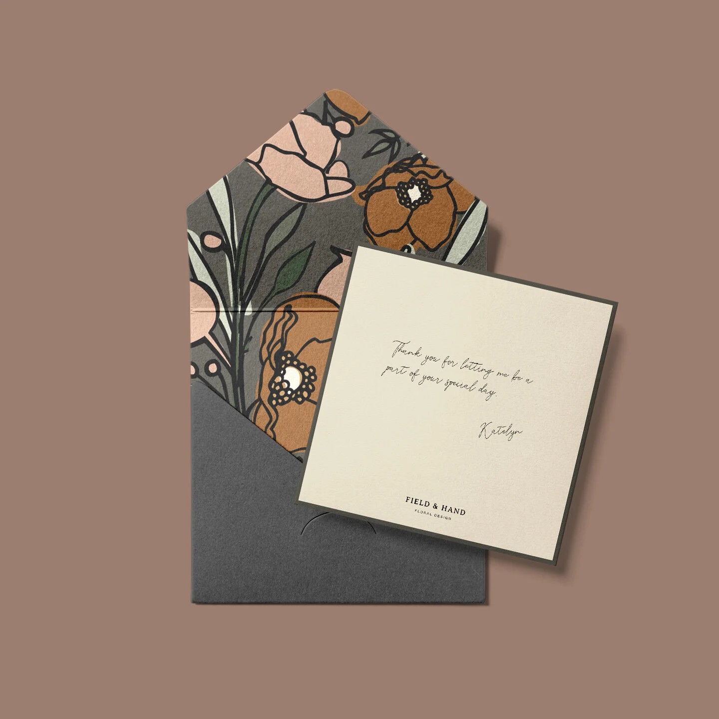
Field & Hand
LOGO DEVELOPMENT, PATTERN ILLUSTRATION,IN-USE MOCKUPS
BRAND OVERVIEW
Katelyn needed a logo developed for her growing floral business. It was important to her that it reflected an organic and effortless aesthetic that felt hand-crafted and unique to her clients. We were able to come up with a few logo variations to create a sense of depth with the brand while allowing for room to grow. The final design elements were inspired by her unique style with using different textures and colors, while staying true to her client’s vision.
TONE
Approachable | Young | Personalized

Cait did a great job of asking questions about my business and goals and using my answers to develop elements that were exactly what I was looking for, without even knowing it. Cait is very effective at what she does!
KATELYN | OWNER OF FIELD & HAND